

The Art of the Setting Corner: Giving Your Kaleidoscope Quilt Room to Breath
A beautiful kaleidoscope block deserves more than a beautiful fabric.
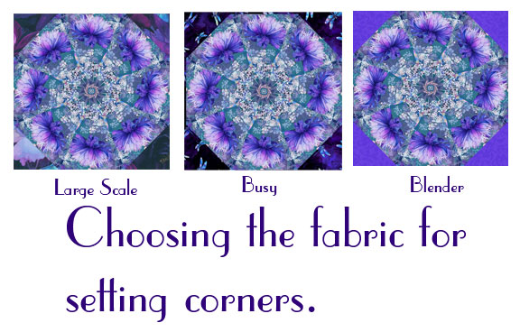
The fabric chosen for kaleidoscope blocks setting corners becomes an important part of the quilt's overall design. It can either frame the kaleidoscope beautifully—or compete with it, interrupt its movement, and make an otherwise carefully engineered design feel surprisingly busy.
At Avalon Bloom, we believe the setting fabric should do more than fill an empty space. “It should give the kaleidoscope room to breathe.”
The Setting Corner Is Part of the Design
One of the most common mistakes when designing a kaleidoscope quilt is treating the setting corners as an afterthought.
They aren't.
Once a kaleidoscope is set to be square, the spaces around it become highly visible. The setting corners create a visual framework around every block. Their color, value, scale, and pattern all affect how the eye sees the kaleidoscope.
Think of the setting fabric as the mat surrounding a piece of artwork.
A picture frame that is too ornate can compete with the artwork inside it. A thoughtfully chosen frame draws your eye toward the picture.
The same principle applies to a kaleidoscope quilt.
Why Kaleidoscope Blocks Need Room to Breathe
Kaleidoscope blocks are naturally attention-seeking—in the best possible way.
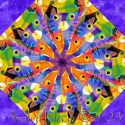
Their symmetry creates movement. Repeated shapes create secondary patterns. Fabric motifs that might look ordinary in a yardage can become stars, flowers, fans, diamonds, or other striking geometric forms when they are transformed into a kaleidoscope.
That visual transformation is the magic.
And magic needs a little space.
When the setting fabric is quiet enough, the eye can clearly distinguish one kaleidoscope from the next. The blocks appear to float within the quilt, and the larger design begins to emerge.
The setting fabric essentially creates “negative space” around the kaleidoscopes.
Negative space isn't wasted space. It is what allows the important elements to be seen.
Color Is Only Half the Equation
Many quilters instinctively choose a setting fabric based primarily on color. Color certainly matters, but it is only one part of the equation.
“Value matters. Scale matters. Direction matters. Movement matters.”
A setting fabric with a large, high-contrast print may be beautiful by itself, but placed immediately beside a kaleidoscope, it can introduce another competing focal point.
A small print with a similar value to the background of the kaleidoscope may recede beautifully.
A solid or low-volume fabric can provide even more breathing room.
The goal isn't necessarily to choose a boring fabric.
The goal is to choose a fabric that knows when “not*” to be the star.
The Importance of Value
Value—the relative lightness or darkness of a fabric—is particularly important.
Imagine a dramatic kaleidoscope made from a contrasting light and dark print. If the setting corners contain another strongly contrasting print, the eye may bounce between the kaleidoscope and the setting fabric instead of settling on the block.
On the other hand, a setting fabric with the right value can create separation and definition.
This is why a fabric that looks perfect in the store, may not be perfect once it surrounds a kaleidoscope.
Always consider the fabric “in relationship to the finished block”, not by itself.
Scale Can Make or Break the Effect
Fabric scale is another frequent culprit.
A kaleidoscope block already takes a fabric motif and transforms it through repetition and symmetry. A large-scale setting print can create an entirely different visual rhythm immediately beside it.
Sometimes that contrast is intentional and works beautifully.
But when it isn't intentional, the result can be visual competition.
A good setting fabric often has a smaller-scale design, a quieter pattern, or enough visual consistency that it reads almost like a solid from a distance.
That lets the kaleidoscope remain the visual anchor.
When More Pattern Is Not More Interesting
Quilters love fabric. We understand the temptation.
You find two gorgeous fabrics and think, “Why choose? I'll use both!”
Sometimes that is exactly the right answer.
But a kaleidoscope quilt can quickly become overcrowded when every space is given equal visual importance.
A successful quilt doesn't necessarily use the most interesting fabric in every available space.
Instead, it establishes a hierarchy.
“What do you want the viewer to notice first?”
If the answer is the kaleidoscope, then the setting fabric should support that decision.
This is one of the fundamental principles of quilt design: “not every element needs to shout.”
The Setting Corners Create Visual Boundaries
There is another reason setting corners matter: they help define the boundaries of the quilt's composition.
Kaleidoscope blocks naturally create movement. Your eye naturally moves from the center, out to the corner setting pieces, and those pieces help establish the rhythm from one block to another.
When the setting fabric is carefully selected, it can visually connect the blocks while still separating them.
The result is a quilt that feels cohesive rather than simply being a collection of individual blocks.
That's the difference between assembling blocks and designing a quilt.
Why Some Kaleidoscope Designs Get This Wrong
There are many kaleidoscope patterns available today, and they are not all engineered with the same attention to the relationship between the block and its setting.
Sometimes the setting fabric is selected simply because it fills the remaining spaces.
Sometimes a designer concentrates so heavily on the kaleidoscope block itself that the surrounding geometry receives less consideration.
And sometimes the finished illustration looks appealing at first glance, but the actual geometry of the block, its rotation, and its relationship to the setting pieces don't work together as cleanly as the picture suggests.
That matters.
A kaleidoscope quilt is not simply a square block surrounded with fabric. The geometry of the block, the seams, the setting pieces, and the overall design must work together.
“The picture is only the beginning. The engineering is what makes the picture work.”
Look at the Quilt From Across the Room
Here's a simple test every quilter can use.
Don't examine your kaleidoscope block from six inches away.
Step back.
Look at the design from across the room.
Squint slightly.
What do you see first?
Do the kaleidoscopes immediately emerge?
Do they appear to have space around them?
Does your eye move comfortably from block to block?
Or does the setting fabric create another pattern that competes for attention?
This simple test can reveal problems that aren't obvious when you're examining individual fabrics on the cutting table.
The Best Setting Fabric May Be the One You Barely Notice
That sounds counterintuitive, especially for quilters who adore beautiful prints.
But consider the job of the setting fabric.
It isn't necessarily there to be admired independently.
Its job may be to make everything around it look better.
When the right setting fabric is chosen, the kaleidoscopes become more dramatic. Their shapes become easier to see. Their symmetry becomes more apparent. The quilt develops rhythm and movement.
And suddenly the viewer isn't thinking about the setting fabric.
They're thinking:
"Look at those kaleidoscopes!”
That's exactly what you want.
A Practical Guide to Choosing Setting Corners
Before committing to a setting fabric, place it beside an actual finished kaleidoscope block and ask:
1. Does the value separate the block from the setting?
If everything is the same value, the block may lose definition.
2. Is the print competing with the kaleidoscope?
If your eye goes immediately to the setting fabric, reconsider.
3. Is the scale appropriate?
Large, high-contrast motifs can create unintended secondary patterns.
4. Does the color support the palette?
The setting fabric should connect the colors of the quilt without necessarily introducing another dominant color.
5. Does it create breathing room?
Look for visual space around the kaleidoscope rather than additional visual noise.
6. Does it work across the entire quilt?
A fabric that looks wonderful beside one block may behave differently when repeated around twelve, twenty-four, or thirty-six blocks.
Good Quilt Design Is More Than Pretty Fabric
Kaleidoscope quilts are uniquely sensitive to design decisions because the blocks themselves create so much visual information.
That is why thoughtful quilt design goes beyond selecting beautiful fabrics and arranging attractive blocks.
It requires understanding how geometry, color, value, scale, negative space, and repetition interact.
At Avalon Bloom, we believe a kaleidoscope pattern should be designed as a complete composition—not simply a collection of pretty blocks.
Because when the geometry is right and the setting fabric is doing its job, something wonderful happens.
The kaleidoscopes don't get lost.
They “bloom”.
And that's when a quilt stops looking like a group of blocks sewn together and starts looking like a carefully engineered work of art.
Give your kaleidoscopes room to breathe. They'll reward you for it.
Keep your quilts blooming.
Rhonda

 About Us